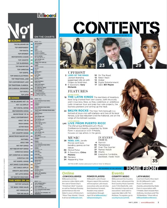
The title of the page is written in capital letters, in a font that connotes with strength and solidness. It contrasts against the withe background and it's positioned at the top of the page above everything else. All this thing make the word "contents" stand out.
Just below it, we can see the issue number.
Too much text on a page might descourage a reader; to avoid this, they have used pictures that relate to the article along with the page numbers that tell the audience where you can find the article. This makes the most important articles (which become the ones with the picture representing them), stand out and easy to find.
The images used on this contents page in particular, (and in several other ones), show artists/people of different ages, gender and ethnicity. This makes the reader feel that the magazine is for everyone, with no distinction of background, even if a pop magazine, for example, will tend to use young people.

The white space(indicated with the green arrow), effectively draws attention to the text as well as the images on the page.
To break up the space they have inserted a picture, which conventionally has something to do with the cover, and represents an important article.
it makes it stand out and helps to keep the reader's interest, breaking out the text that otherwise would be "boring".
The bottom part 0f the magazine advertises what other features are available online as well as what events the magazine is participating in.
The blue line is the divider which breaks the page up into several sections, making it easier to read.
The fact that it is blue makes it stand out even more as there is little colour (besides the pictures) on the page.
The page is divided into blocks, depending on what the articles that are in that section are about, which makes it a lot easier for the audience to distinguish and find them.
The subtitles (such as "Music", "Features", "Upfront"), are essential, as is label to group all the music articles that we will find in the same place, and the reader doesn't need to go through all the magazine to find what he's looking for.
This makes it navigate through it easier, faster and don't bore the reader with too much information.


No comments:
Post a Comment