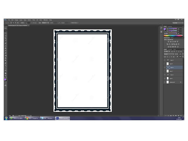
I started my contents page doing the most logical thing.
and I just rewrote "Contents" in the same typography characters that i'd used before.
I wanted to add Wyke's logo, so I've moved "Contents" to the left, and add the logo on the right.
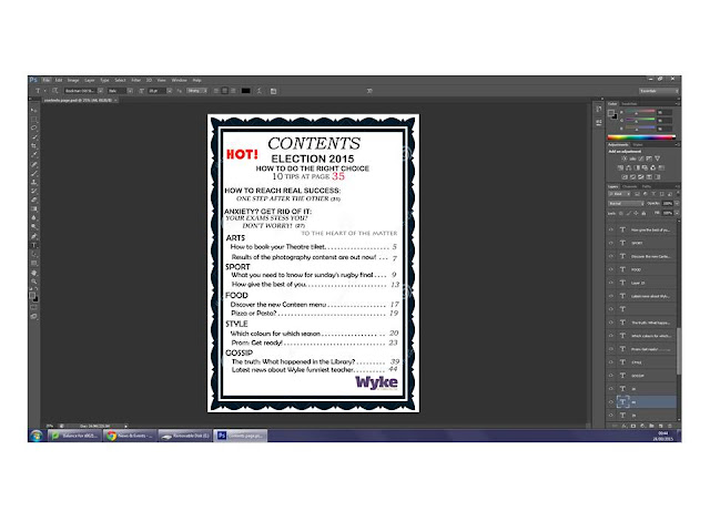
I wasn't satisfied with the result, so I moved "Contents" where it was before, and I've put the logo at the bottom of the page, on the right side, as if it was a sign.
I definitely preferred the page in the second way, so I started writing the effective contents.
I didn't want "Gossip" to be the first contents of the page, because it isn't the focus of the magazine, so I moved it at the bottom of the page, and I kept going up in inverse order.
I continued following the same style, and I put the line "hot" just before adding the content that I'd used in the cover as Main Line.
So I did.
I decided to change the typography characters.
I expanded the size of "Contents", because it risked to be much less remarkable than the line "Hot!".
I added the page numbers, linked with the content by some spots, as I'd seen in some real contents page, and because I honestly liked this style.
I changed the color of the "main content" page, to make it stand out.
I cut off the word "page" from the second and the third content, and I added the magazine slogan.
I modified the number of the pages, to make it "real"; as contents as "results of the photography content are out now", being results, would probably take less pages (2) than, for example, "What you need to know for rugby final" (which is a lot of information, four pages).
At finished work, I added a picture developing one of the contents.
The picture has white background, to make everything alike.
The picture has white background, to make everything alike.


No comments:
Post a Comment