Friday, 25 September 2015
Thursday, 24 September 2015
Font Cover Creation
COVER ONE
1
This was my vert first attempt: I tried to put purple (Wyke colour), one the picture selected, and it didn't fit.
2

So I tried changing the colour from purple to Yellow, and It got better, but not enough.
FRONT COVER 2
1
As first thing I added the Masthead and the Barcode.
2
I reduced the barcode, added: price, website, slogan.
I selected a big typography character for number 10, I placed a black stripe at the bottom of the page, to make stand out the line "A perfect year", and I wrote "learn how inside" in smaller characters and in a less eye catching colour.
I made the line "the right choice" and the word "election" in paler yellow, and I wrote the line "Exclusive" in green, colour that I hadn't already used but not annoying compared to the others.
I placed a picture of the two sutton trust finalists..
4
I wrote their names.
5
I add an asterisk,(as I saw in some real magazines), and I replicated the black/yellow stripe that I had used at the bottom of the page.
6
I added another picture, this time related to a sport article, and I added another sell line (Exams anxiety?)
7
I tried to put the line "magnificent seven" on the picture.
8
A variation of the masthead.
9
Another variation of the masthead.
10
When I had the black stripe under the masthead, I moved the website and the slogan on it.
11
And another one.
FRONT COVER 3
This is another version of the front cover, COVER 1 and COVER 2 are both completed.
1
2
3
4
5
6
Draft Contents Page Creation
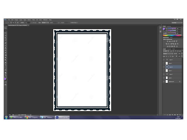
I started my contents page doing the most logical thing.
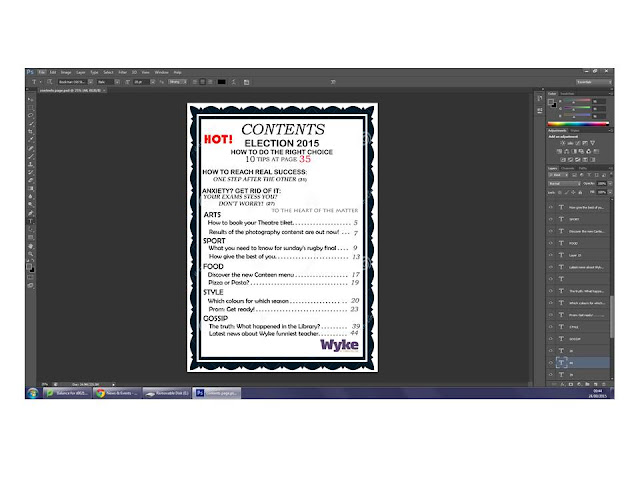
and I just rewrote "Contents" in the same typography characters that i'd used before.
I wanted to add Wyke's logo, so I've moved "Contents" to the left, and add the logo on the right.
I wasn't satisfied with the result, so I moved "Contents" where it was before, and I've put the logo at the bottom of the page, on the right side, as if it was a sign.
I definitely preferred the page in the second way, so I started writing the effective contents.
I didn't want "Gossip" to be the first contents of the page, because it isn't the focus of the magazine, so I moved it at the bottom of the page, and I kept going up in inverse order.
I continued following the same style, and I put the line "hot" just before adding the content that I'd used in the cover as Main Line.
So I did.
I decided to change the typography characters.
I expanded the size of "Contents", because it risked to be much less remarkable than the line "Hot!".
I added the page numbers, linked with the content by some spots, as I'd seen in some real contents page, and because I honestly liked this style.
I changed the color of the "main content" page, to make it stand out.
I cut off the word "page" from the second and the third content, and I added the magazine slogan.
I modified the number of the pages, to make it "real"; as contents as "results of the photography content are out now", being results, would probably take less pages (2) than, for example, "What you need to know for rugby final" (which is a lot of information, four pages).
At finished work, I added a picture developing one of the contents.
The picture has white background, to make everything alike.
The picture has white background, to make everything alike.
Photographs For Front Cover
01
I liked the picture, but not the light (It was a rainy day).
Then, it wasn't a proper medium close up.
01 B
So I tried to crop it, but the result wasn't the one I was looking for.
02
I liked this picture, most of all the background and the hair moved by the wind.
03
This picture was taken during the sunset, so one part of the face is too dark and the other too bright.
04
Same for this one.
05
I didn't like the perspective of this one.
06
I actually liked this one.
07
The subject is too serious, but the light is better than the others.
08
Still too serious
09
I like how the hair stood on the shoulder, giving movement at the shot.
10
The subject is not smiling, but the hair were perfect.
11
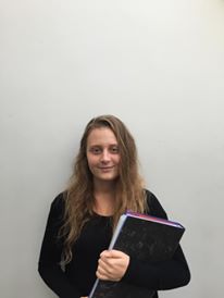
I tried the classical "white wall" one, and I didn't like the result.
12
This is a variation of the previous.
Still don't like the result.
Still don't like the result.
Subscribe to:
Comments (Atom)


