Cover

My product

In my Colour Scheme, I respected the conventions, using as main theme this bright pink, accosting it to black so that the result wouldn't be nauseous.

My product

I used bright shapes and boxes around section of text as is conventionally done, making it interesting.
The fonts, emphasized by the colours (which respect the colour scheme), are really feminine.

My Product

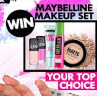
I used both a Fashion section and I´m giving as a gift a make up set.

My Product
My magazine is called POPpular.

My Product

My Masthead uses a clear, bold font. The letters are in capital form, so that they can stand out. To attract teenagers I used stars and I kept doing it through all the magazine, which made it a housestyle feautre of my magazine.

Summary of Conventions / Cover
I´ll tick (✔) the ones that are featured in my magazine, and put a cross (X) next to the ones that aren't.
✔ Masthead -- The title of the magazine, on the top of the page; usually the most eye-catching convention in the magazine. It has to be distinct.
✔ Headline -- main statement, usually in the largest and boldest font, describing the main story. (A banner head story spans the full width of the page
✔ Strapline -- Seen as an introductory headline below the masthead, describing the magazine
✔ Top and Bottom Strips -- Strips below and above the magazine that give further information to what may be included in the magazine.
✔ In House -- "Trademarks" of the magazine. e.g. Colour scheme - House colours
✔ Slug -- "In-house" logo for this particular section. e.g. reviews have a different slug from interviews
✔ Pull Quotes -- Enlarged quotes
✔ Sidebar -- An additional box next to the main feature of the magazine
X Secondary leads -- A sneak preview of an inside article or story; usually a picture
✔ Tag -- Categorizing the reader's interest in a story by using a word or phrase to engage them
✔ Box-out -- A colored (or black with white text, if the rest of it stands out)
X By-line -- Name of the reporter
✔ Caption -- Text underneath a image, explaining it
X Credits -- In the form a beeline the author is usually credited; some magazines may have the name of the photographer below it, especially if it is a famous and known one.
✔ Crosshead -- A subheading that shows in the body of the text and is centered above the column of text. If it is to one side, then is called Side-head. e.g. Sensational, Exclusive
✔ Exclusive -- This means that newspaper and no one else solely cover the story. The paper will pay their interviewees, buying the story so it cannot be used by another paper.
✔ Kicker -- A story designed to stand out from the rest of the page by the use of a different font (typeface) and layout
✔ Barcode, Issue Number, Date and Price -- Fundamental for the selling process
✔ Website -- Usually below the masthead
✔ Lure -- Could be used as a marketing device , it's usually a word or a phrase that makes the reader want to read the article
✔ Serif -- Fonts with fancy feet
✔ Sans Serif -- Fonts without fancy feet
✔ Drop-cap -- The first letter of the article tends to be in a larger/different/elaborate form
✔ End Marker -- Fancy/elaborate full stop at the end of the article
✔ Masthead -- The title of the magazine, on the top of the page; usually the most eye-catching convention in the magazine. It has to be distinct.
✔ Headline -- main statement, usually in the largest and boldest font, describing the main story. (A banner head story spans the full width of the page
✔ Strapline -- Seen as an introductory headline below the masthead, describing the magazine
✔ Top and Bottom Strips -- Strips below and above the magazine that give further information to what may be included in the magazine.
✔ In House -- "Trademarks" of the magazine. e.g. Colour scheme - House colours
✔ Slug -- "In-house" logo for this particular section. e.g. reviews have a different slug from interviews
✔ Pull Quotes -- Enlarged quotes
✔ Sidebar -- An additional box next to the main feature of the magazine
X Secondary leads -- A sneak preview of an inside article or story; usually a picture
✔ Tag -- Categorizing the reader's interest in a story by using a word or phrase to engage them
✔ Box-out -- A colored (or black with white text, if the rest of it stands out)
X By-line -- Name of the reporter
✔ Caption -- Text underneath a image, explaining it
X Credits -- In the form a beeline the author is usually credited; some magazines may have the name of the photographer below it, especially if it is a famous and known one.
✔ Crosshead -- A subheading that shows in the body of the text and is centered above the column of text. If it is to one side, then is called Side-head. e.g. Sensational, Exclusive
✔ Exclusive -- This means that newspaper and no one else solely cover the story. The paper will pay their interviewees, buying the story so it cannot be used by another paper.
✔ Kicker -- A story designed to stand out from the rest of the page by the use of a different font (typeface) and layout
✔ Barcode, Issue Number, Date and Price -- Fundamental for the selling process
✔ Website -- Usually below the masthead
✔ Lure -- Could be used as a marketing device , it's usually a word or a phrase that makes the reader want to read the article
Typography:
✔ Serif -- Fonts with fancy feet
✔ Sans Serif -- Fonts without fancy feet
✔ Drop-cap -- The first letter of the article tends to be in a larger/different/elaborate form
✔ End Marker -- Fancy/elaborate full stop at the end of the article
Contents Page

My Product
Here, I respected and followed the stereotypes to make it look as similar as possible to a real magazine. The masthead is present, as are the main image and the different sections. I followed the same, specific colour scheme that I used on the cover, so that it can all flow well.

My product
I created my contents page taking inspiration from WE LOVE POP, so my contents page resembles a lot one of theirs. That is why I´ve got a single section.

I used the colour wheel as well.
Summary of Conventions / Contents Page
I´ll tick (✔) the ones that are featured in my magazine, and put a cross (X) next to the ones that aren´t.
✔ Multiple Images: (At least 4) About 8-9 or 1 big image that dominates per one page or 2/3 pages.
✔ Contents page should (have to reflect) the Front Cover.
✔ Largest Image should be the Cover Star.
✔ Not all Contents is on a Contents Page (But the majority is.)
Weekly: About 50/60 pages.
✔ Monthly: About 140/180 pages. (Significantly more than Weekly.)
70% AdvertisingX Divide Contents into sections: Feature, Interviews, Reviews, ...
✔ Page Number at least from page 6/8 upwards
Elements to include (!)
✔ Subscription Offer
✔ Letter from the Editor (Fancy Signature)
✔ Magazine Housestyle and Branding: Colour, Logos, Masthead on the same Typography.
Double Page Spread

My Product
I decided to put my text in a box instead of placing it around the picture. My artist take excatly half of the page.

I used a quote, with a peculiar choice of fonts, because I wanted it to stand out.

Of course you can find a intro in my double page spread. Something that important couldn´t be missed.
No comments:
Post a Comment